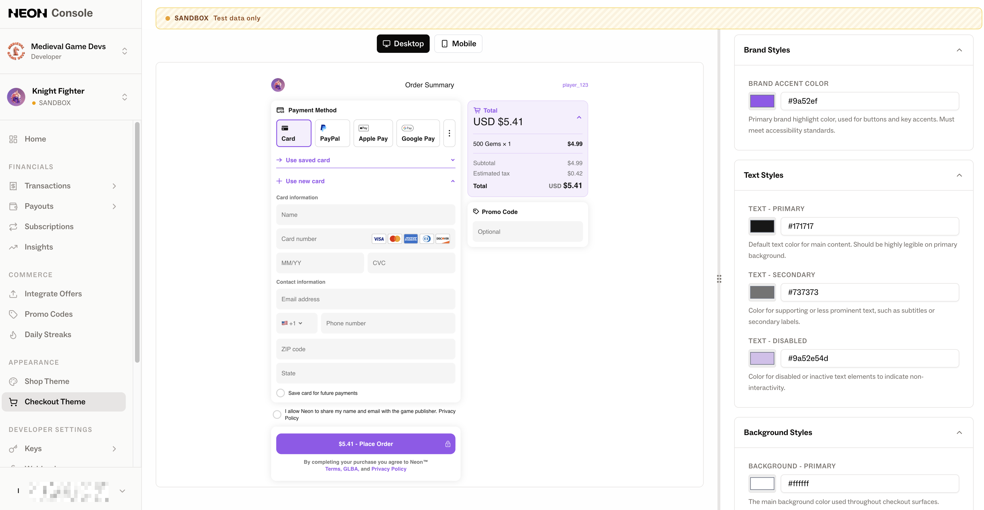
Checkout Theme
Configure the look and feel of your Neon Checkout
Customizable Checkout Theme
The Customize Checkout Theme page in the Neon Console allows you to define the visual appearance of the checkout experience for each environment. You can adjust brand, text, background, stroke, and state colors, as well as select a checkout font.
Each environment maintains its own theme configuration, so you can safely experiment with styles without affecting live checkouts. Changes are applied immediately after saving—no redeploy or code updates required.
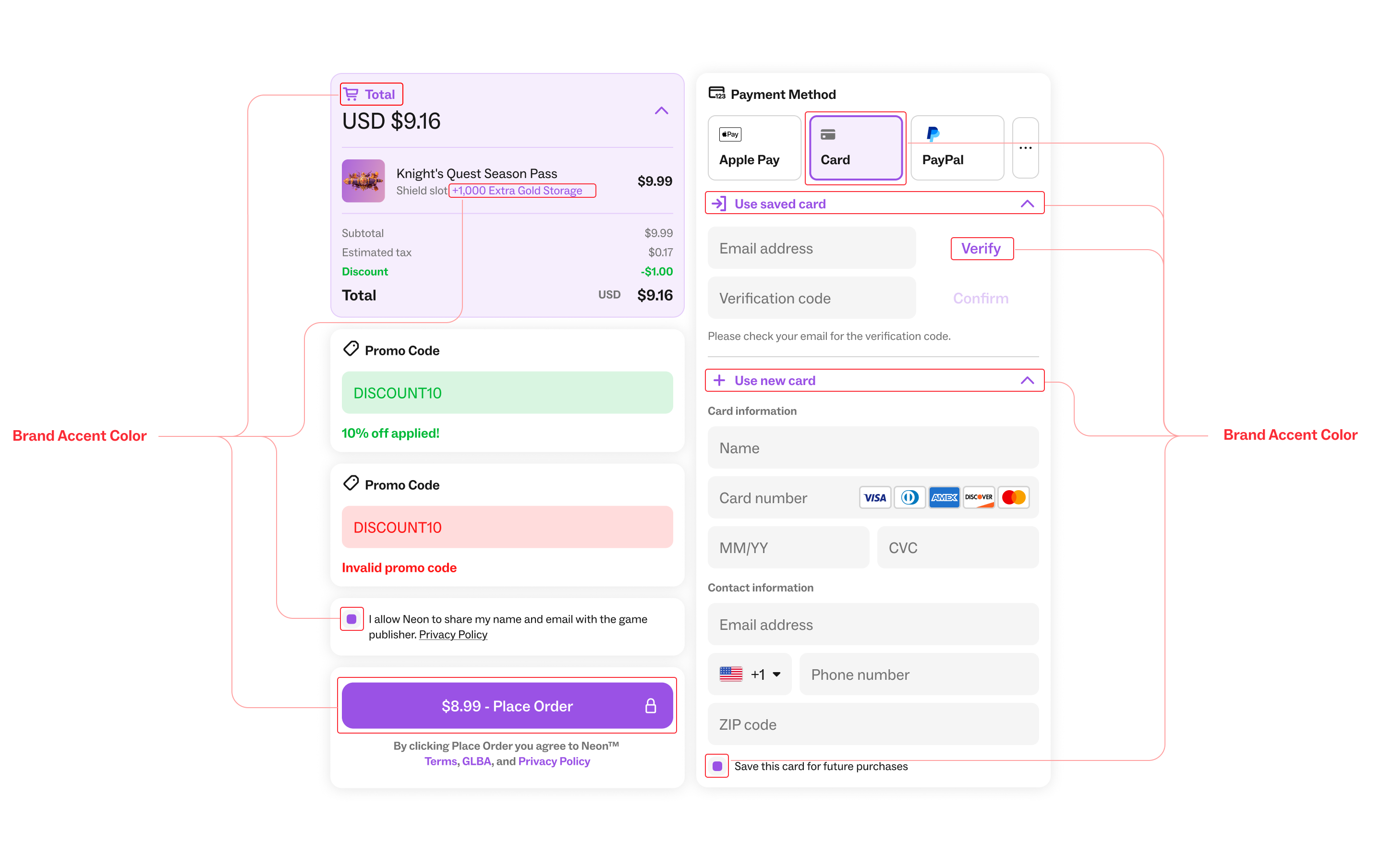
Brand Styles
Brand Accent Color: Used for primary buttons, highlights, and key interactive elements.
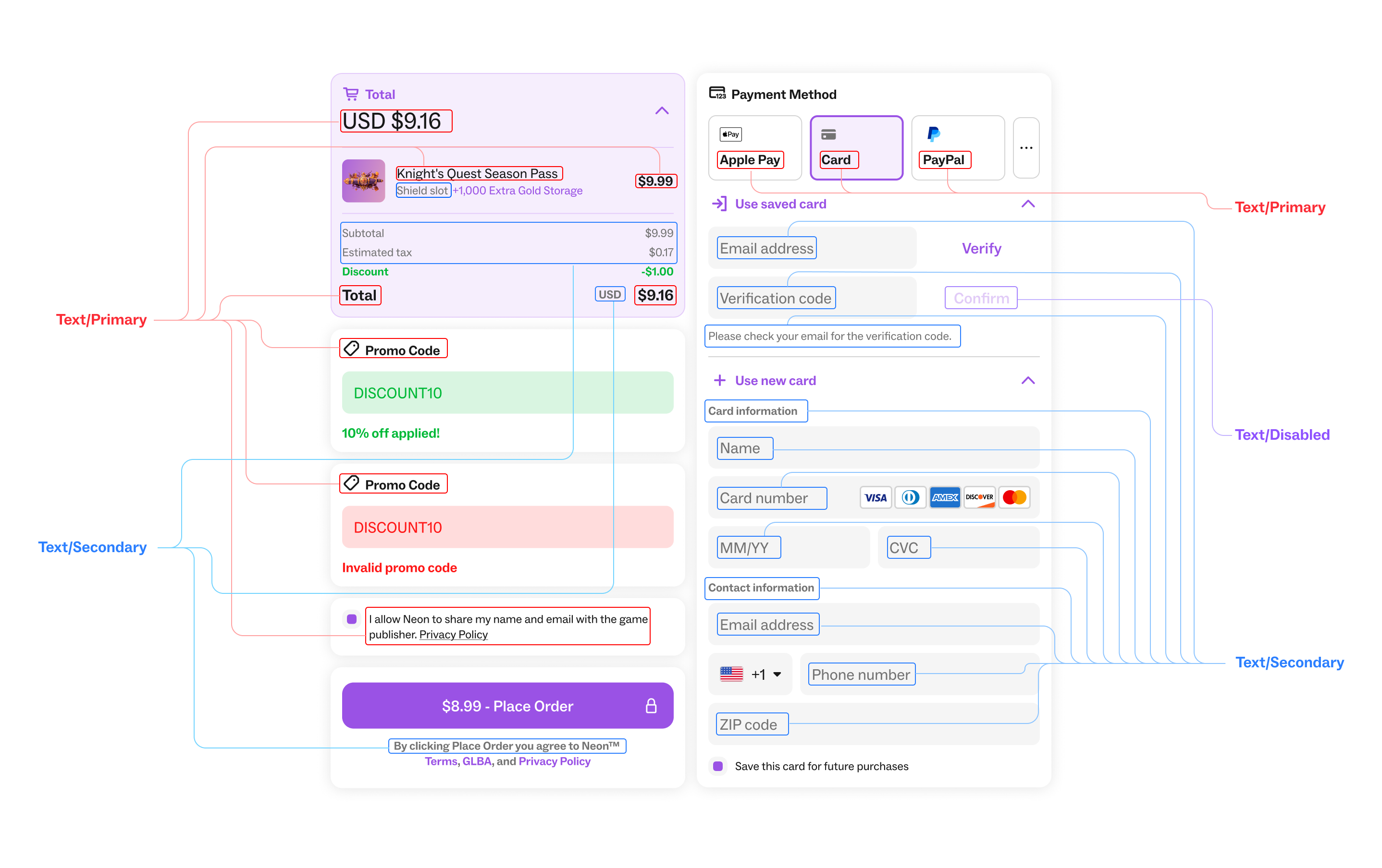
Text Styles
Text - Primary: Default text color for main content.
Text - Secondary: Used for supporting or less prominent text, such as subtitles or secondary labels.
Text - Disabled: Indicates inactive or non-interactive elements.
Background Styles
Background - Primary: Main background color for checkout surfaces.
Background - Selected: Background used for selected states, rows, or active items.
Text Field Background: Background color for input fields.
Drop Shadow: Color applied to shadows for depth and layering.
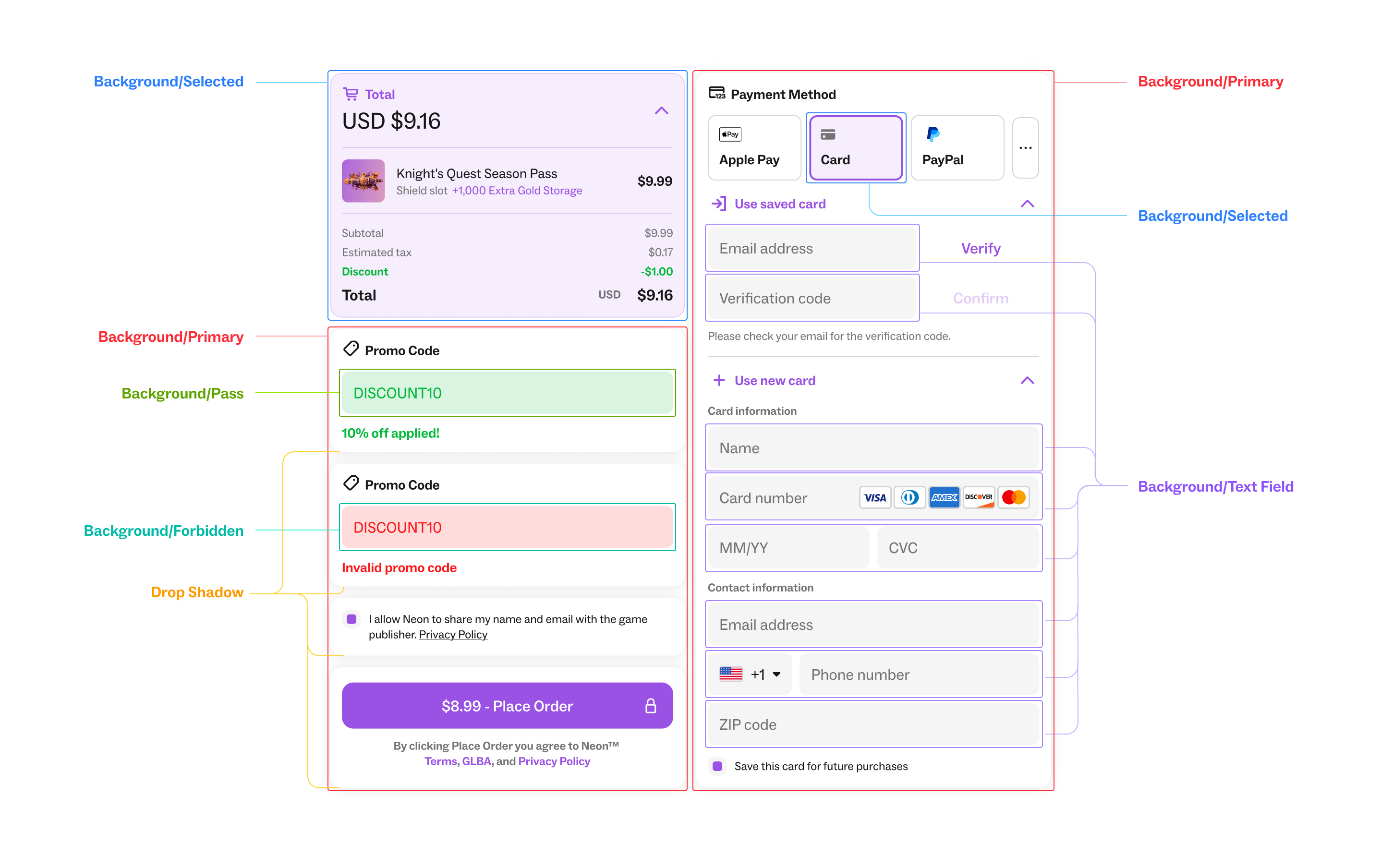
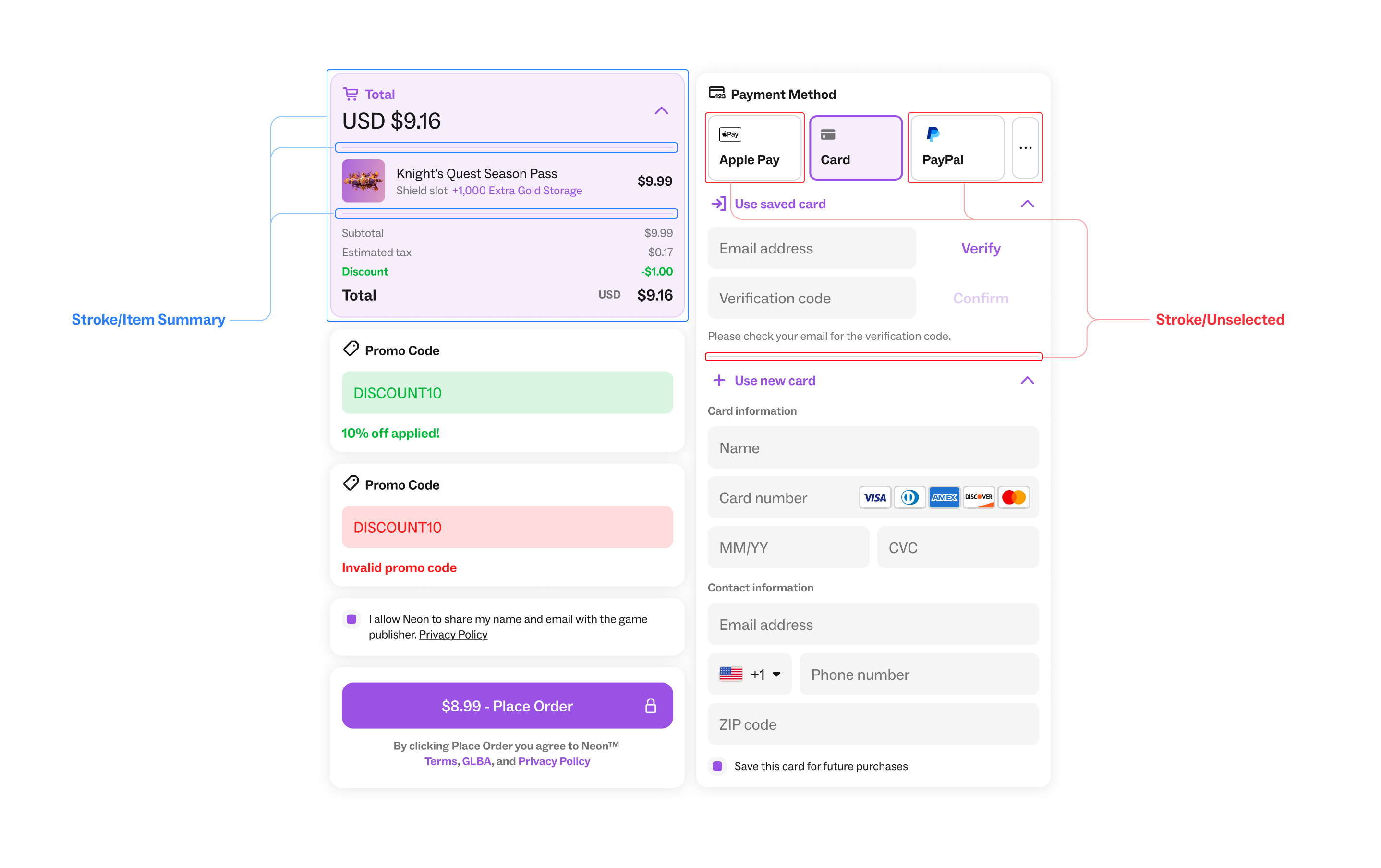
Stroke Styles
Stroke - Unselected: Border color for unselected elements or input fields.
Stroke - Item Summary: Border color specifically used in item summary sections.
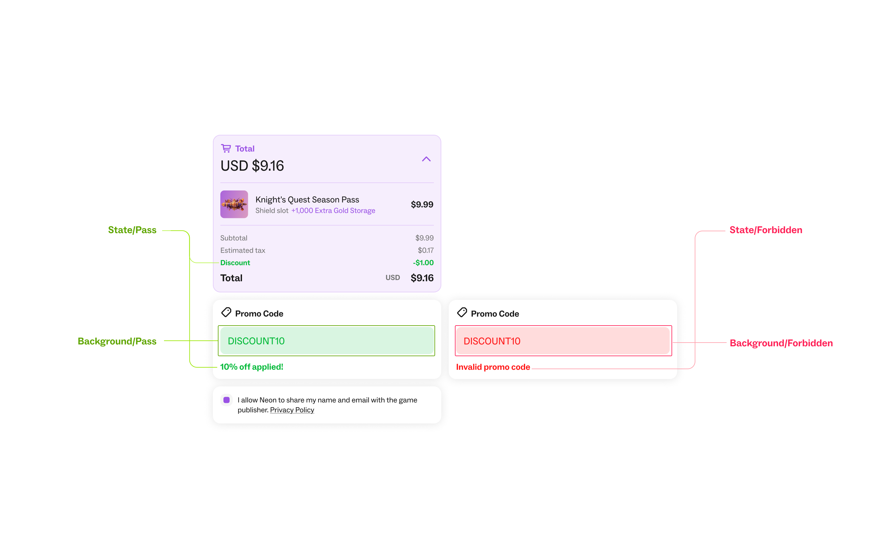
State Styles
Pass State: Indicates a valid or successful state.
Pass State Background: Background paired with success states.
Forbidden State: Indicates an error, warning, or forbidden action.
Forbidden State Background: Background paired with error or forbidden states.